
Anki is a free open source Spaced Repetition System Platform. Its follows a Function over Form
Due to the free nature of the App, UI is more or less stuck in the 90’s and less than to be desired about.
Such a functional App needs a equally functional UI.
Anki has garnered quite the reputation amongst social circles revolving around a ton of memorization.
Power Users of the Platform find it to be the design to be impeccable while the beginners users think otherwise.
I decided to explore this stark Discrepancy and try to find a solution

The open source nature of the app comes with a ton of benefits like being free, widely available and highly customizable for people with the right tools. However a much bigger downside to this is, there just aren’t enough resources to dedicate to proper UX/UI unless the product reaches a sizable userbase and doesn't rely on good Samaritan donations.
Enforcing the previous point even harder, this comes as a consequence. While power users of the app find it absolutely flawlessly functional, the new users have the complete opposite experience. Being a niche product, wide heuristic for such a flow just isn’t widespread
The Extreme static nature of the app keeps the users guessing what’s actually happening on screen. Though nice looking animations aren't priority, some minimal animations with some kind of transition would be highly appreciated in the community.
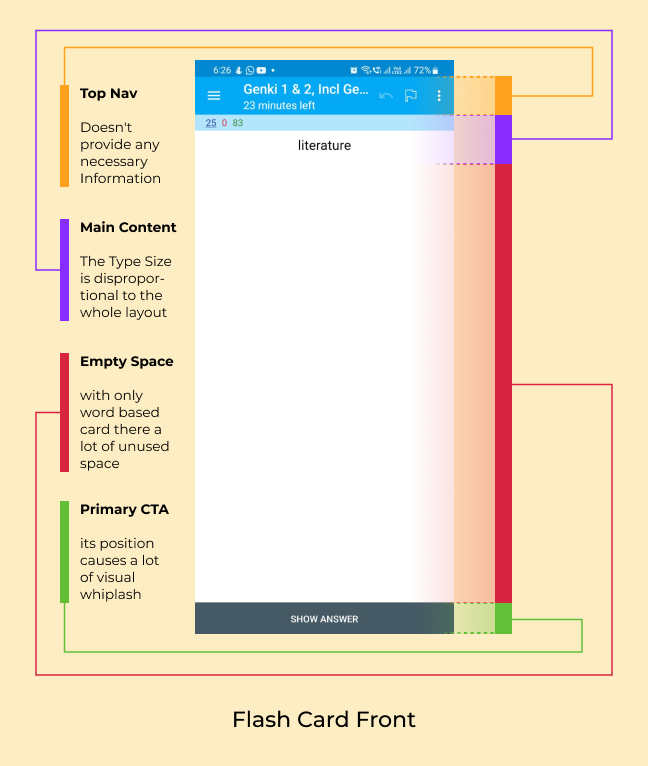
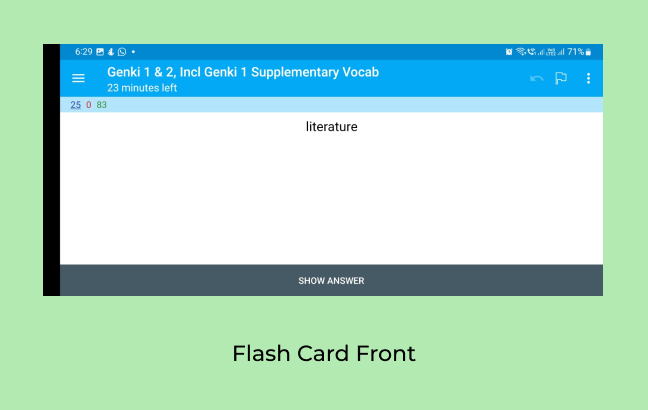
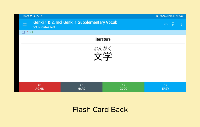
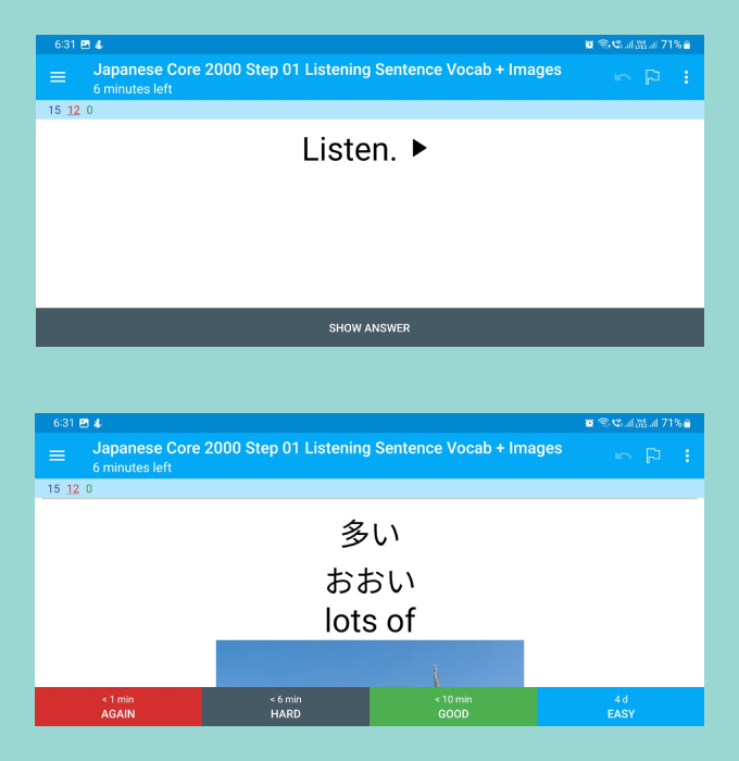
The default state the App comes in is the portrait orientation, A vast majority of the user base uses the app for only text base flash cards. this very nature of the app results in sub optimal usage of screen space.
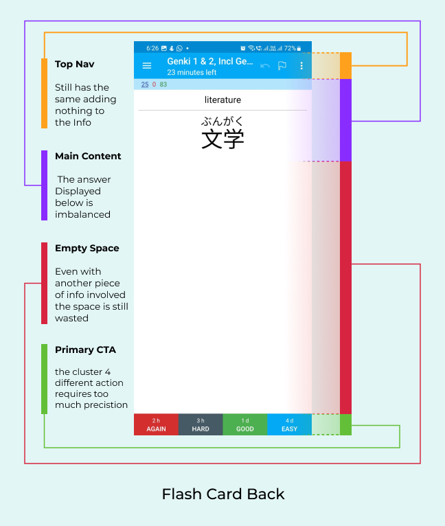
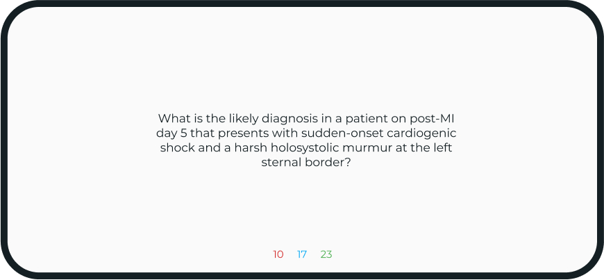
The other side of the flash card acts as a combination of both sides as it shows the question and answer together. tough it makes sense, it in away some aspect of feedback is taken away, making the whole composition really static.
Turning the App to landscape doesn't to much to add to the composition, as here it makes it even more prominent, just how not useful the whole Top Nav bar is. Taking nearly 27% of the whole screen, it shows information which the user already knows and doesn’t need immediate access to all the time.
The other side of the card looks even more cramped now that things are more squished in. the target area of the buttons become more accessible but it comes at the cost of awkward thumb placement. The rest of the composition suffers from the same shortcomings.
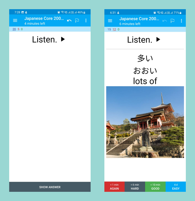
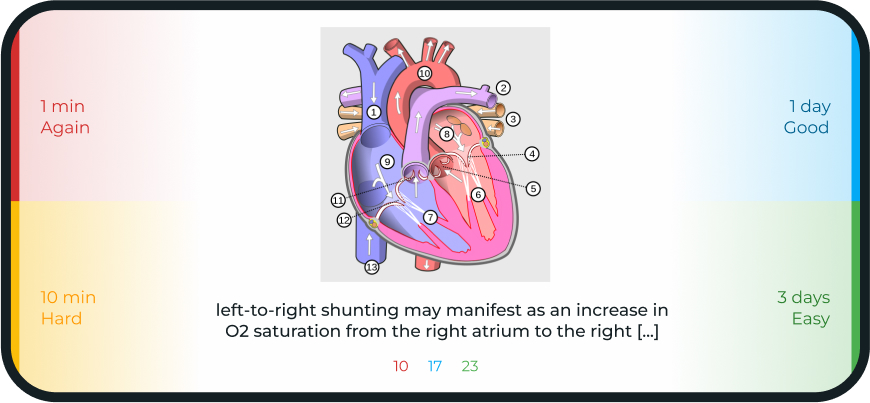
Another big feature of Especially in the Med Student community is adding pictures and audio in addition to text. This is done in the app by having the image appear in a fixed height format which make images with wider aspect ratios appear smaller.
The Landscape version of decks with pictures truly shows how poorly designed the interface is. Requiring scrolling on every image, makes the experience really tedious. Wider images get it the worst as most of the information can't be viewed in a singular screen.
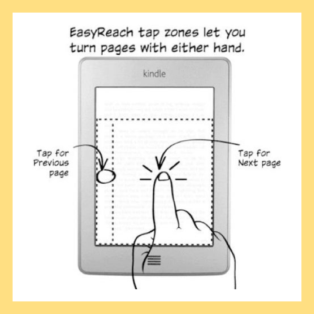
The Amazon Kindle has some of the best usage of invisible User Interface. A tap on 80% of the right side turns over a page while a tap on the left side takes you to the previous page. while the a small top section is reserved for all kinds of different secondary actions.
This approach to Actions might may come as a surprise to new users and take some time to adapt. However once it becomes second nature user can hit the asymmetric target zones with accuracy which is highly repeatable.
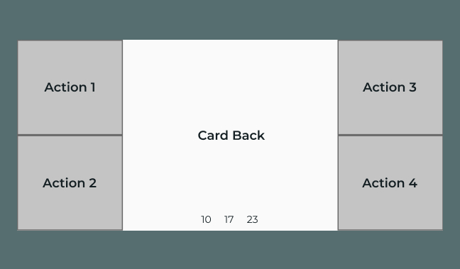
Using distinct separate dedicated zones for the 4 main primary actions and a separate action for the secondary actions, a much cleaner Interface could be achieved.
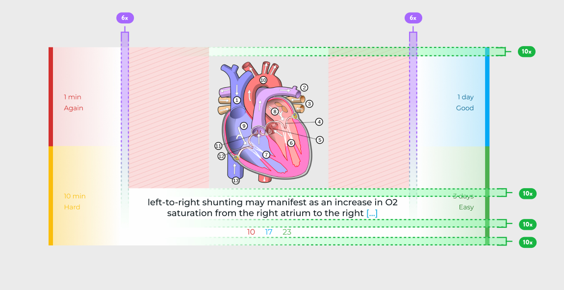
Making the the orientation to be only landscape makes the decision for the user easier. taking out the top nav which just showed the name of the deck was an obvious move since, its absolutely an unessential piece of info which could be shown with a secondary action. the only other piece on info that remains in view is the card count in the deck’s session which are color coded by type.
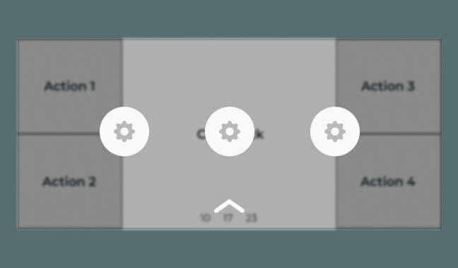
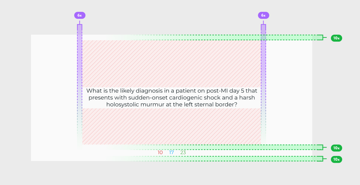
The Back/Answer side of the card would be divided into kindle like zones with the main CTAs placed far apart on the edges of the screen. the secondary actions would be accessible via a scroll from the top like the notification panel. the zonal sections makes accidently hitting the wrong action nearly impossible. And a person could be reasonably be expected to build up muscle memory to use the app without any guidelines.
Swipes and Taps are the 2 main ways of interacting with a screen. with taps already assigned to 5 different action, a swipe could be used to present as many secondary options as require. this would behave like a notification swipe down from the top and use the preconceived heuristics of the user reducing the learning curve.